LIFE July !939
ON Page 66 LIFE Calls on the Duke and Duchess of Windsor
After Deaths, Delay in Sale Of Windsors' Possessions
By CAROL VOGEL
Published: September 03, 1997 in The New York Times
Sotheby's announced yesterday that it was postponing its auction of more than 40,000 objects belonging to the Duke and Duchess of Windsor from the couple's famous Paris home. The announcement came as Sotheby's experts were putting the finishing touches on the objects' installation in preparation for the nine-day sale that was to begin at the auction house's York Avenue headquarters on Sept. 11. Sotheby's said the decision had been made in accord with the wishes of Mohamed al-Fayed, owner of the Windsors' villa and its contents, after the death on Sunday of Mr. Fayed's son Emad and Diana, Princess of Wales, in a car crash in Paris.
''As a mark of respect, I believe there should be an appropriate interval before the auction takes place,'' Mr. Fayed said in a statement issued yesterday. No new date has been set, but officials at Sotheby's said they were hoping the sale would occur early next year.
Mr. Fayed acquired the long-term lease for the turn-of-the-century Louis XVI-style stone villa on the fringes of the Bois de Boulogne along with its contents after the Duchess died in 1986. She had left the villa to the Pasteur Institute, the major beneficiary of her estate, which transferred the lease to Mr. Fayed.
The contents of the house, which were assembled by the Duke and Duchess with the help of Stephane Boudin of Maison Jansen, the Parisian decorators, have been restored by Mr. Fayed. He and his family have been living on the top floor of the house, and the rest has become a private museum. In July, when Sotheby's announced the sale, it said Mr. Fayed had decided to auction the couple's possessions primarily to gain space: he and his family needed more room and plan to take over the rest of the house.
Proceeds from the sale, projected at $5 million to $7 million, are to go to the Fayed International Charitable Foundation, which supports pediatric research.
''This will be the first major sale Sotheby's has ever postponed, but it was absolutely the right thing to do,'' said Diana D. Brooks, Sotheby's chief executive worldwide. ''There are times when commercial considerations have to be put aside, and you have to do what your moral compass tells you is right. Mr. Fayed was sensitive to the situation, but in his heart this obviously is what he was most comfortable with.''
Fayed to sell Windsors' Paris treasures
DAVID USBORNE NEW YORK TUESDAY 08 JULY 1997 in The Independent
Pleading lack of space for his family in the former Paris home of the Duke and Duchess of Windsor where he lives, Mohamed al Fayed is to sell the entire array of the couple's goods and chattels that have until now remained inside it.
The collection, which includes the desk at which the then King Edward VIII signed the papers of abdication in 1936, as well as a piece of the wedding cake from his marriage to the American-born Wallis Simpson, is to be auctioned by Sotheby's in New York over nine days from 11 to 19 September.
The largest single sale to be undertaken by Sotheby's, it is sure to generate excitement among the legions of devotees of all things British and royal, in the United States especially, and eclipse the Christie's sale of 79 dresses from Diana, the Princess of Wales, here two weeks ago.
Mr Fayed bought the Bois de Boulogne residence of the Windsors from the City of Paris in 1986 on a 50-year repairing lease. He moved with his family into what had been the servants' quarters on the top floor. At the same time, he acquired all of the couple's possessions from the Pasteur Institute to which they had been bequeathed by the Duchess, who died in 1986.
While the collection's value has been set at about pounds 3m, Diana Brooks, president of the auction house, said yesterday that she expected the final tally from the sale to be "well in excess" of that sum. Some are already valuing the entire batch of 40,000 items at pounds 30m.
Mr Fayed, the owner of Harrods and of the Paris Ritz hotel, said that the entire proceeds from the sale would be distributed to children's charities in Britain, continental Europe and North and South America. "You will understand that this has been a very, very difficult decision for Mr Al Fayed," his spokesman, Michael Cole, said in New York. However, he added that with his wife, Heini, and his four children, Mr Fayed could no longer live in the house without expanding into the lower floors.
Insisting on the uniqueness of the sale, Mr Cole added: "Never has there been, probably since the reign of King Charles I, this number of possessions of an English king come at once on to the market for sale."
Experts at Sotheby's were also adding their assessments of the importance of the auction. "Every object tells a story," declared Joe Friedman, director of English furniture. "Through the collection it is as if the Duke and Duchess themselves were telling their own story. There could be no more intimate or poignant a record."
Under the gavel will be items ranging from paintings by Munnings and Degas, coins, military pieces, and, perhaps above all, the full array of the couple's wardrobes which, in some eyes, set them apart as important arbiters of fashion and taste in the middle of the century.
January 08, 1990 in People
Egypt's Al Fayed Restores the House Fit for a Former KingBy Joyce Wadler, Fred Hauptfuhrer
The stately villa, in Paris's Bois de Boulogne, has an intimate feel: The clothes of the late master and mistress of the house, the Duke and Duchess of Windsor, still hang in the closets. A portrait of the duchess, painted by Cecil Beaton shortly before the King of England renounced his throne for her in 1936, hangs over her tub. On the duke's bed is the rag doll given to him by his mother, Queen Mary. Even the man polishing glasses in the kitchen is a hand-me-down: Valet Sydney Johnson, 66, worked for the Windsors until the duke's death.
And if you think owning a residence with the previous occupants' linens still on the beds seems a little peculiar, the new tenant, Egyptian billionaire Mohamed Al Fayed, knows what you mean. "It's like a mausoleum," says Al Fayed, who spent $12 million for the furnishings and a just-completed renovation of the villa as a private museum. "It sometimes gives you the creeps—both of them having died here. But it's still a happy place, a great fantasy which I love to live in."
For the Anglophile Al Fayed, 60ish, adding the Windsor villa to an inventory of properties that includes a castle in Scotland, a country house in Surrey, a chalet in Gstaad and a penthouse on London's Park Lane fulfills a lifelong dream. "The impression of a great empire and a King dropping everything because of his love for a woman—this is what I lived with as a child," he says.
Leased from the city of Paris in 1952 by the duke and duchess for about $28 a year rent, the three-story villa became the site of life in the highest style. The royal crest of Edward, Prince of Wales, was emblazoned in brass upon the front door and carried as a theme throughout the interior. The staff numbered up to 19. Toilet tissue was unrolled and folded into squares by the servants. The couple's beloved pugs, tended by a footman, ate from silver bowls. For dinner parties, the duchess demanded the lettuce leaves be the same size and shape.
The guest list in the '50s and '60s was all glitter: Marlene Dietrich, Aristotle Onassis, Elizabeth Taylor, the Aga Khan. But there were times even the duke seemed to realize how empty such nonstop indulgence could be. "Do you know what my day was today?" he once asked a friend. "I got up late and then I went with the duchess and watched her buy a hat."
The duke died in 1972. Johnson, who had been in the duke's service since age 16, stayed on, but when his wife died the following year, the Windsors' loyal retainer was forced to resign. The duchess would not allow him to leave at 4 P.M. to look after his children, and his obstinacy on the issue made her bitter. "I never want to see you again," she told him.
"I have four children," he snapped. "Let me take care of my four children. And you take care of your four dogs." The duchess died 13 years later, at 89, after a series of strokes.
By then, the villa had fallen into disrepair. Furniture was marked with pug teeth marks; the roof was leaking. The sovereign's banner from Edward VIII's brief reign was tissue-thin and flaking. The duchess, so exacting about her possessions in life, was indifferent to their fate after her death. Her will stated that the Windsors' treasures should be disposed of by the executors and most of the proceeds given to the Pasteur Institute. Possession of the villa was to revert to the city of Paris.
Mohamed Al Fayed had other ideas. Known in France for his elegant restoration of the famed Ritz Hotel, he had made headlines in Britain the previous year by purchasing the 102-store House of Fraser retail chain—including the famous Harrods—for $842 million.
In the art of luxury living, Al Fayed, whose wealth is conservatively put at $7 billion, might have taught the Windsors a few things. He owns a helicopter and a 12-passenger Gulfstream jet. He is surrounded by an entourage of bodyguards, advisers and several decorous young female assistants. His first wife, Samira, sister of Adnan Khashoggi, was well connected; his second wife, Finnish-born Heini, is beautiful. (Al Fayed has one grown son, Dodi, a movie producer, from his first marriage and four young children from his second.)
Al Fayed—who made his first millions in construction and shipping—acquired a love for all things English as a child in Egypt. He dresses in Savile Row suits and need never fret about matching them up to the proper shirt—he owns Turnbuil & Asser, a blue-blooded haberdashery. Al Fayed met the duke and duchess just once, at a cocktail party at the villa in the '60s. "I was completely taken by their manner and their warmth," he says.
Some time before the death of the duchess, Paris Mayor Jacques Chirac, impressed by Al Fayed's work at the Ritz, spoke to him about leasing the villa. Al Fayed liked the idea of restoring the house—he had, after all, begun reclaiming the Windsors' realm in 1977 by hiring Johnson—but he suggested to Chirac that he also purchase the villa's contents. Keeping the Windsors' belongings together appealed to the executors of the estate as well. In 1986 Al Fayed leased the villa for 50 years for a nominal rent and set about restoring it.
But accounting for all of the villa's lavish furnishings soon put him at odds with the Windsor estate. On the estate's side, executor Maitre Suzanne Blum and historian Michael Bloch, who edited the Windsors' letters, claim that Al Fayed tried to obtain the duchess's jewels for a rock-bottom price. (These and other valuables were later sold at auction for $50.3 million.) "Haggling isn't the word for it," says Bloch. "It was like the grand bazaar at Constantinople." Al Fayed, who denies this charge, claims that executors swiped the Windsors' love letters and that a trustee spirited away the dining room table and chairs.
Still, Al Fayed managed to acquire most of the villa's contents for several million and spent several more refurbishing them. The Chippendale table at which the duke signed his letter of abdication was sent back to English furniture experts who reglued its joints and rejuvenated its tooled leather top. The duke's polo trophies and his ceremonial sword were sent to silversmiths to be reburnished. The tattered sovereign's banner was rewoven by French craftsmen.
Last month the work was completed, and Al Fayed chartered a 737 to fly 120 guests from London for an opening afternoon tea (and caviar) party. "Very tastefully done," said Earl Spencer, Princess Di's dad, who was among the guests. The party over, Al Fayed says two floors of the villa will be opened to "historians, members of the British royal family, personalities, friends and important guests of the Ritz." The extensively remodeled third floor he will use as a private apartment.
He does not see himself sleeping in the duke's bed or squeezing into one of his old dinner jackets. But he does plan to succeed where the Windsors failed, by keeping the villa in the family "as a good example for my children and grandchildren to follow in my path."
Joyce Wadler, Fred Hauptfuhrer in Paris
OUTSIDE LOOKING IN -Mohammed al Fayed-
By ROMESH RATNESAR Sunday, June 24, 2001 in Time Magazine World
For a few weeks this summer, much in the world seemed right for Mohammed al Fayed. In July, at his villa in St.-Tropez, the Egyptian tycoon personally set in motion a romance between the Princess of Wales and his eldest son Dodi by plucking him off one family yacht to join his father on another one nearby, where Diana was tanning. As the romance blossomed into the possibility of an engagement, al Fayed feigned nonchalance. "Normal people fall in love," he told an interviewer. "That's it." But al Fayed surely exulted inside. His battles with the British establishment--over his 1985 purchase of Harrods, his unrewarded quest for citizenship, his hand in bringing down Tory ministers--had left him embittered. In Diana he picked up the jewel both prized and tossed aside by the English elite, a diamond with an edge that could cut. Snaring her, and perhaps even installing her in the former residence of the Duke and Duchess of Windsor (which al Fayed holds), would simultaneously concoct an alternative monarchy and remind the real one of a time when it had faltered.
But al Fayed's world collapsed that Sunday morning in Paris, when he lost the son he loved and the princess he sought, and, too, the chance for acceptance from the country he adopted. From the start of the fated relationship, the force that pulled Diana toward the Fayeds was powerful: beyond sharing their sense of rejection, the princess undoubtedly craved the cocoon made possible by Dodi's family planes and mini-palaces, as well as the glamour of his Ritzy life. And after years in a family repelled by emotion, here was a family driven by it, whether in its public vendettas or in its private Mediterranean moments. To embrace all this, Diana, having left one dynasty that had used her, was ready to enter another. The Fayeds and she would find redemption together.
The union of Diana and Dodi would have culminated three decades of exhaustive and expensive attempts by the sixtyish Mohammed al Fayed to prove his British bona fides by collecting some of the nation's trophies. In addition to Harrods, he owns the famed humor magazine Punch, the Fulham Football Club and Balnagow castle in Scotland; his millions have sponsored the annual Royal Windsor Horse Show, where he has shared the royal box with the Queen. Al Fayed's younger brother Ali owns Turnbull & Asser, the prestigious tailor used by Prince Charles and his sons William and Harry. And al Fayed has long courted Diana and her parents; he put her stepmother Raine on the board of Harrods. Diana's father Earl Spencer, while dying, reportedly told al Fayed to "keep an eye" on the family.
Despite these ingratiating efforts, and his considerable commitments to various charities, acceptance within the British elite has eluded al Fayed. In France his restoration of two fabled Paris properties, the Ritz Hotel and the Bois de Boulogne villa of the Duke and Duchess of Windsor, earned him La Legion d'Honneur. But in Britain al Fayed could recite--and often did--a list of the many slights directed at him by the Establishment. After he poured $50 million into restoring the Windsor villa, he grumbled to the New York Times, "Not one single official said, 'Mohammed al Fayed, thank you. We are grateful.' Not one single letter."
From the start, al Fayed has portrayed himself as the victim of English arrogance, xenophobia and racism. Elites, he contends, resent him for owning Harrods. "It sticks in their throats," he told the Times. But the Fayeds have also inflicted much damage on themselves, starting with their unsuccessful attempts to rewrite their history. In 1985 the largely unknown Fayed brothers paid $689 million in cash for the House of Fraser retail chain (whose flagship was Harrods). Two years later, the Department of Trade and Industry--at the instigation of al Fayed's chief rival for control of Harrods--began investigating the family. Its report, published in 1990, concluded that the brothers did not hail, as they had claimed, from "an old Egyptian family" with a 100-year history of landownership and shipbuilding. "The image created...of their wealthy Egyptian ancestry was completely bogus," the report said. The government further concluded that the money al Fayed used to purchase Harrods could not have come from an inherited fortune, as he claimed, but was probably put up for al Fayed by his associate, the Sultan of Brunei, the world's wealthiest man.
Al Fayed was not accused of breaking any law, and he and the Sultan denied the charges. Al Fayed bitterly attacked the report as a smear. "They could not accept that an Egyptian could own Harrods, so they threw mud at me," he once said. But acquaintances of his in Alexandria also describe the Fayeds as a modest family: al Fayed's father was a language teacher, and al Fayed grew up on the rougher side of town. He started as a small-time trader there, selling Singer sewing machines and Coca-Cola. In the early 1950s the future Saudi billionaire Adnan Khashoggi offered al Fayed a share in a Khashoggi business that exported Egyptian-made furniture to Saudi Arabia. The company took off, and not long after, al Fayed married Khashoggi's sister Samira, who gave birth to Dodi in 1955. He divorced her after two years and went into the construction business in the United Arab Emirates. After befriending Dubai's ruler, al Fayed won big development contracts for British firms prowling the Persian Gulf. "Of course," says Khashoggi, "there were fees and commissions." This brokering was the foundation of the Fayed family fortune.
But even as he grew richer, al Fayed could not achieve his most cherished goal: to become a British citizen. The Fayed brothers' applications for citizenship stalled in the early '90s following the release of the report. It did not matter that they had paid millions of pounds in taxes annually, or that all four of al Fayed's children by his second wife are British. So al Fayed struck back in 1994 and revealed to the Guardian that for more than two years he had supplied Tory Members of Parliament with cash and free stays at the Ritz Hotel in exchange for political favors. Only afterward did the government officially turn down the brothers' citizenship request, without explanation--a decision al Fayed is appealing. The scandal, meanwhile, brought down two M.P.s and fueled a public outcry that contributed to the Conservatives' defeat in last spring's general election. Al Fayed seized the high ground, declaring he was "sick and tired of the hypocrisy that goes on at the highest level of government." But he failed to see that his revelations had brought to light his own culpability as a briber and that he would draw further resentment from Britain's power circles.
Al Fayed's public persona, all bluster, defiance and eccentricity, has done little to burnish his image. He is reportedly obsessive about personal security, employing a large number of bodyguards. He is litigious, and his dismissal of scores of Harrods' employees also invited litigation against him. And despite the riches he flaunts--a fleet of 64 Rolls-Royces, properties on London's Park Lane, a $32 million yacht--his record as an entrepreneur is very mixed. Last year the board of the weekly Observer rebuffed al Fayed's attempts to buy the paper, saying it was not for sale. In 1995 Rupert Murdoch shut down his Today newspaper rather than sell it to al Fayed. Bids to purchase the London News Radio station and the Daily Express have also failed. At Harrods profits rose 6% last year, but the company's debts increased to a staggering $264.3 million for the year ending January 1996. And financial sources told TIME that at least one international investment bank considered underwriting a public offering of Harrods' stock but harbored doubts because of continuing questions about al Fayed's reputation.
For his part, Emad ("Dodi") Fayed did not share his father's relentless pursuit of British approbation. From an early age he had a flair for the cosmopolitan, moving comfortably among Egyptian, French, Greek, American and British friends. He was educated at the St. Mark's school in Egypt, the Le Rosey school in Switzerland and the Royal Military Academy at Sandhurst. Childhood friends remember him as pleasant and well bred, and touched by loneliness, owing in part to his parents' divorce. Says Zizette Kishk, a family friend from Alexandria: "He was a very shy and quiet boy who had somewhat of a sad air about him."
Dodi's adolescence was spent shuttling among homes in Alexandria, Dubai and France. At 15 he was reportedly given his own Mayfair apartment, Rolls-Royce and chauffeur. He is said to have abandoned a fledgling career in the United Arab Emirates air force in favor of one in show business, establishing a London film-production company in the late 1970s. "He was financed by his father," Khashoggi says. With the elder Fayed's help, Dodi supplied $3 million of the $6.5 million total budget for the 1981 movie Chariots of Fire. In subsequent years he announced dozens of projects that he later dropped, and most of his investments were modest. "Dodi didn't work a day in his life," says an industry insider. "This is a guy who really enjoyed life."
He developed a reputation as a networking playboy who didn't always pay his bills. His father provided him with a reported monthly allowance of $100,000, but he allegedly owed hundreds of thousands of dollars to landlords in L.A. and New York City. Some of these accusations turned out to be ill founded, but at least one was still haunting him when he died. Kelly Fisher, the model who told tabloids in July that Dodi had pledged to marry her even as he squired Diana, accused him of writing checks to her that bounced. Yet along with these complaints, Dodi had plenty of associates willing to testify to his charm and affability. Khashoggi described his sister's son as "very quiet about life...a nice polite man, very courteous." Says a close friend: "He was with this one and that one, but he was very nice with them... Even when the story ends, he was very nice, acting like a gentleman."
Although they seemed to come from different worlds, Diana and Dodi were shaped by many of the same traumas--divorced parents, an unhappy first marriage and the death of a parent (Diana's father, Dodi's mother). The couple first met in 1986, at a polo match, but this summer, with the elder Fayed's prodding, the pair developed an intimate bond. "He was tres gentil, especially as Princess Diana would have seen him," says Dodi's friend. "All her life she was meeting very cold people. He was a big change for her." Al Fayed spokesman Michael Cole recalled speaking to Dodi in August, after news of the romance had broken. "Michael," Dodi said, "I will never, ever, have another girlfriend."
By the night of their death, the couple had decided to marry, according to some friends and relatives. Early in the summer, Mohammed al Fayed cleared out the Windsor villa in France and put 40,000 items on the auction block at Sotheby's. His family needed the extra space, al Fayed said, but some royal watchers breathlessly speculated that he was preparing a retreat for his son and the Princess of Wales. Few things would have proved more noisome to the royals than Diana, with an Egyptian husband and father-in-law, spending time in the former residence of another exile from royalty.
After the tragedy, al Fayed provided refreshments from Harrods to Britons waiting to sign Diana's condolence books. He chose not to return Dodi's body to Egypt, instead burying it at Brooklands Cemetery in Woking, an act that marked both his grief and his unrealized dreams of British belonging. There will be sympathy for him, but anger too from those who might blame the family for placing the princess in such mortal peril. Without prompting last Friday, Cole said al Fayed had "only wanted [Diana and Dodi] to be happy and to get to know each other. The Fayed family wanted nothing from the princess." The surprise was that those words needed to be said at all.
The Crown Season 2 finally tackles the dark
underbelly of Edward VIII's personality and political leanings after carefully
tip-toeing around the subject in Season 1. For those unfamiliar with Edward,
the Duke of Windsor (Alex Jennings), and his ties to Adolf Hitler's Nazi Party,
the disdain characters have toward him might seem a little harsh. However, when
learning the full extent of Edward's admiration and collusion with Hitler in
Episode 6, "Vergangenheit," viewers realize alongside Queen Elizabeth
(Claire Foy) that this joker needed to be booted from Britain.
The reveal
of Edward's alliance with Hitler plays out on The Crown as all the Netflix
drama's storylines do: the top secret information is doled out delicately, set
to the swell of violins, as a doe-eyed Foy shudders under its weight.
At first,
on The Crown, the Marburg Files are unearthed by the Allied forces, and though
Britain's government wants to stall on publishing them, the Americans push for
transparency. This leads to Queen Elizabeth being briefed on some of the
content regarding her uncle, the Duke of Windsor. She has a conversation with
him and decides, without the full story, that as the head of the church of
England, she has an ethical obligation to forgive him.
Of course,
things get messier when the Queen tells Tommy Lascelles (Pip Torrens) she's
willing to forgive Edward. He answers curtly through his mustache, "Before
you make your decision, ma'am, I believe you should be in full possession of
the facts." According to Lascelles, "The Duke of Windsor made his
loyalties clear as soon as he became King."
Lascelles
calls Edward's chosen court fellows known Nazis, and says the British
government stopped briefing Edward on matters of national security; they
believed he may have been involved in treasonous activities. When he abdicated
the throne, Edward took his wife to visit Hitler in Germany. Lascelles claims
the duke plotted to overthrow Elizabeth's father, reinstate himself as king and
give Hitler and the Nazis freedom to prowl Western Europe. Lascelles even
alludes to Edward having visited a concentration camp, though he adds, "Of
course, the full horrors were yet to come, but nonetheless, he visited."
Just when
it appears that Elizabeth cannot handle more bad news, Lascelles asks for
permission to continue. He alleges that Edward colluded further with the Nazis,
informing them that the Allied Forces had seized Hitler's military plans, which
"gave Germany time to change its plan" and eventually take control of
Paris. Finally, Lascelles adds, as the anxious-sounding score enters the frame,
Edward assured the Germans that Britain would fall to Nazi control as well, as
long as the bombing of his own citizens continued.
In response
to all this information about her uncle, Elizabeth denies him a job in British
government and exiles him and his wife from the country. The episode is
harrowing, of course, but does it align perfectly with the historical truth?
What we
know about Edward's trip to Germany, while it was under the rule of Adolf
Hitler and the Nazi Party, is that Hitler himself concluded that "the Duke
of Windsor was an advocate of the Nazi cause and could be of future use,"
according to The New York Times and Philip Ziegler's biography of Edward VIII.
According to Vanity Fair, the plan to reinstate Edward as a puppet king under
the Nazi regime was hatched three years after Edward and his wife visited
Hitler, as opposed to being concocted on that very trip (as it appears in The
Crown).
The
intercepted telegrams that suggested Edward was in on the plot surfaced in
1953, and Winston Churchill (with Dwight Eisenhower behind him) tried to cover
up the documents, alleging that they were "tendentious and
unreliable," according to The Guardian. We do see Churchill, in the
episode's cold open, tell the king and gathered dignitaries that the Marburg
Files (specifically the Windsor File incriminating Edward) cannot see the light
of day, but his reasoning for hiding them isn't explored at length.
Some
British historians, including Carolyn Harris, maintain Churchill's argument and
believe that Edward wasn't aware of the plot to make him King of England (under
Hitler). According to The BBC, Harris says Edward's motives in meeting Hitler
were "peaceful" and more about finding a place in government for
himself and his wife after abdicating the throne. The BBC also points out that Edward's
assistant, Sir Dudley Forwood, later said that the entire trip to Germany was
about making the Duchess of Windsor feel included in state affairs. According
to Forwood, Edward wanted his new, American bride to feel important, even if
she had to (figuratively) step over the bodies of Hitler's victims to do it.
Royal
biographer Andrew Morton, author of "17 Carnations: The Royals, the Nazis
and the Biggest Cover-Up in History," found a way to condemn Edward's
ignorance and suggest that he was indeed a Nazi sympathizer, though Britain
tried its best to keep that a secret. "[Edward] was certainly
sympathetic...even after the war he thought Hitler was a good fellow and that
he'd done a good job in Germany, and he was also anti-Semitic, before, during
and after the war," Morton wrote.
Though no
one can say for sure exactly why Edward brought his wife to meet Hitler, it's
safe to say he at least sympathized with some part of the Nazi regime, which
makes him, in the most literal sense of the term, a Nazi sympathizer.
Edward was
appointed governor of the Bahamas during the controversy surrounding his Nazi
ties, and after a stint there, he lived out the rest of his life in France. The
Crown does touch on Edward's time in the Bahamas, which Elizabeth informs him
was a tactic to keep him away from the war in the mainland, but it doesn't do
much with Edward's character beyond making Elizabeth confront him. If Edward
was involved with Hitler and the Nazis, which historical documents seem to
suggest, it feels especially hollow to remember that he simply lived out his
life of luxury in France, socially ostracized but not tried for treason.
The Crown
Season 2 is streaming on Netflix.
17
Carnations: The Royals, the Nazis, and the Biggest Cover-Up in
History
by
Andrew Morton
“For fans of the
Netflix series The Crown, a meticulously researched historical tour
de force about the secret ties among Franklin D. Roosevelt, Winston
Churchill, the Duke of Windsor, and Adolf Hitler before, during, and
after World War II--now in paperback.
Andrew Morton tells
the story of the feckless Edward VIII, later Duke of Windsor, his
American wife, Wallis Simpson, the bizarre wartime Nazi plot to make
him a puppet king after the invasion of Britain, and the attempted
cover-up by Churchill, General Eisenhower, and King George VI of the
duke's relations with Hitler. From the alleged affair between Simpson
and the German foreign minister to the discovery of top secret
correspondence about the man dubbed "the traitor king" and
the Nazi high command, this is a saga of intrigue, betrayal, and
deception suffused with a heady aroma of sex and suspicion.
For the first time,
Morton reveals the full story behind the cover-up of those damning
letters and diagrams: the daring heist ordered by King George VI, the
smooth duplicity of a Soviet spy as well as the bitter rows and
recriminations among the British and American diplomats, politicians,
and academics. Drawing on FBI documents, exclusive pictures, and
material from the German, Russian, and British royal archives, as
well as the personal correspondence of Churchill, Eisenhower, and the
Windsors themselves, 17 CARNATIONS is a dazzling historical drama,
full of adventure, intrigue, and startling revelations, written by a
master of the genre.”
Unmasked,
Edward the Nazi King of England: Princess Diana's biographer reveals
the Duke of Windsor's collusion with Hitler… and a plot to regain
his throne
Unique microfilm
revealed the innermost workings of the Nazi regime
Found
incriminating correspondence relating to former King of England
New book by Diana
biographer reveals the Duke of Windsor was willing to deal with
Hitler to win back his throne
Called Hitler a
'great man' and openly criticised Churchill the 'warmonger'
Was convinced
conflict could've been avoided if he stayed on the throne
The Nazi leader
would put the Duke back on the Throne as a puppet king
However, details
of the secret deal were ordered destroyed after the war
Winston
Churchill, Clement Attlee and American President Eisenhower among
those who attempted to cover up damning dossier
By Andrew Morton For
The Mail On Sunday
PUBLISHED: 22:07
GMT, 28 February 2015 | UPDATED: 19:50 GMT, 1 March 2015
It was the most
unlikely place to find a treasure trove: tucked inside a battered
metal canister covered in a tatty plastic raincoat and hidden in a
remote German estate, where it had been hastily buried in the dying
days of the Nazi regime.
The men who
discovered it in the weeks following the end of the war were dubbed
‘documents men’, Allied soldiers charged with finding the secrets
of Hitler’s Third Reich. Inside was unique microfilm that revealed
the innermost workings of the Nazi regime. Back in London, the haul
was triumphantly called pirates’ gold.
But within days,
they realised with horror that the thousands of files detailing every
part of the Nazi regime’s inner workings contained incriminating
correspondence relating to the former King of England, Edward VIII,
his wife – the divorced American Wallis Simpson, whom he married in
1937 – and their links to dictator Adolf Hitler.
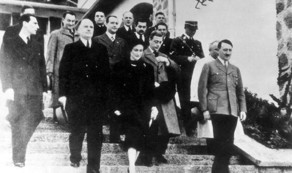
Honoured guests:
Edward and Wallis depart Hitler’s mountain retreat in October 1937,
after meeting the Fuhrer
The book claims that
the Duke, center, was angered at being forced to abdicate the throne
in 1936 and was willing to work with Adolf Hitler, right, to regain
it
This was dynamite
that could explode beneath the Monarchy.
For the next 12
years, war leader Winston Churchill, post-war Prime Minister Clement
Attlee, American President Eisenhower and others in the political
elite attempted to destroy or cover up the damning Windsor dossier.
Even King George VI,
at loggerheads with his elder brother, the Duke of Windsor, since his
abdication in 1936, was ‘greatly agitated’.
Now my three years
of research have uncovered the extent of Edward’s Nazi sympathies
and the monumental efforts lasting more than a decade by the
Establishment on both sides to trace, conceal and destroy vital
documents that they feared could bring down the House of Windsor.
The jaw-dropping
contents of the file concerned the wartime activities of the Duke and
Duchess of Windsor, particularly their brief stay in Spain and
Portugal after the fall of France in 1940. The secret papers painted
an astonishing portrait of a man who was disaffected with his
position, disloyal to his family and unpatriotic towards his country.
The file revealed
that such was his disaffection that Churchill, his friend and
supporter, had threatened him with court martial unless he obeyed
military orders.
During this Iberian
sojourn, many of Edward’s unguarded utterances were secretly
recorded by German diplomats and pro-Fascist Spanish aristocrats who
sent the material in minute detail to Berlin, where Hitler and his
right-hand man, foreign minister Joachim von Ribbentrop, pored over
the Royal runes.
The transcripts
reveal that Edward, who felt he had been ostracised and humiliated in
the wake of his abdication in 1936, was outspoken in his criticism of
Churchill and the war and was convinced that, if he had stayed on the
throne, conflict could have been avoided.
He was angered at
being forced to abdicate the throne in 1936 because he wanted to
marry American divorcee Wallis Simpson, left, and was willing to work
with Hitler, right
The Duke of Windsor
chats to Hitler’s propaganda chief Joseph Goebbels at a party in
Berlin in 1937
Only the continued
heavy bombing of British cities, he believed, would bring the United
Kingdom to the negotiating table. Taken at face value, the Duke was
speaking high treason, giving succour to the enemy when Britain faced
its darkest hour of the war. If the German files were to be believed,
here was a man who had no faith in his country’s leaders or his own
family. He was also a man who fully approved of Hitler and his
spurious plans for peace.
Worryingly, they
chimed with Washington’s intelligence. American ambassadors to
Spain and Portugal who met the couple at this time were so alarmed
that they sent messages to Washington reporting that the couple were
‘indiscreet and outspoken against the British government’.
Historian John Costello later described the Duke’s sentiments as
‘tantamount to treason’.
Such was the
dangerous importance of these unguarded private utterances that it
gave the Nazi high command complete faith in a sinister plot to
entice the Duke and Duchess to stay in Spain, where he would wait for
the Germans to invade and conquer his homeland. Then the man who
spent his honeymoon in Austria before the war and visited Germany in
October 1937 as Hitler’s honoured guest would return to Britain as
the Fuhrer’s puppet king.
The Nazis even had a
code name for the plot – Operation Willi – which was the
extraordinary climax to a bizarre entanglement between the Duke, the
Duchess and Hitler which began shortly after he was elected German
Chancellor in 1933.
Not only did Hitler
try to marry Edward, then Prince of Wales, to a young German
princess, but he then flooded London with a slew of Nazi supporting
aristocrats with orders to find out what their Royal cousins were
thinking. The stammering Duke of York, Edward’s brother and later
King George VI, was blunt about this blue-blooded Nazi courtship. ‘My
own family relations in Germany have been used to spy and get
particulars from other members of my family,’ he later observed.
Edward and Wallis welcomed them with open arms.
The couple,
pictured, married at a private ceremony on June 3, 1937 in France and
honeymooned in Germany
Edward, right,
celebrates his marriage to Wallis Simpson in France in June 1937 with
a cup of tea
The Duke of Windsor
marries Wallis Simpson in 1937
As serious doubts
began to be raised at home about Edward’s fitness to be King, he
was viewed inside the Third Reich as a friend and ally of the Nazi
regime.
Wallis Simpson came
under special scrutiny from both sides. Even Hitler was intrigued by
her relationship with the pompous but charming Von Ribbentrop, who
had singled her out for special attention when he was Nazi ambassador
in London in the 1930s.
It was said Von
Ribbentrop sent Wallis bouquets of flowers, ordered from society
florist Constance Spry, to her home. The Prince of Wales’s cousin,
the well-informed Duke of Württemberg stoked the rumour mill,
stating that the bouquets of 17 carnations (some say they were roses)
represented the number of occasions Wallis and Von Ribbentrop had
slept together.
Hitler is a great
man... Churchill's a warmonger
Such was the concern
about the proximity of Wallis and her then husband Ernest to the
future King that at the height of her clandestine affair with Edward
in 1935, Scotland Yard detectives were ordered to watch the couple
and delve into their private life.
It emerged that not
only was Ernest hoping for a high honour when the new King took the
throne, but his wife was two-timing him and Edward with a third man,
Ford car salesman Guy Trundle.
It was also
discovered that a neighbour in Wallis’s apartment block, Bryanston
Court in Central London, was Princess Stephanie von Hohenlohe – a
woman who had been monitored by the security services since 1928.
They considered her a political intriguer – possibly a Nazi spy,
but certainly a woman with direct access to Hitler himself. It was
not long before worried Establishment figures wondered if Princess
Stephanie and Wallis were working hand-in-glove, and Bryanston Court
was a nest of espionage and plotting.
Military leaders had
serious concerns about the Duke of Windsor, right, and his wife
Wallis Simpson, left
MRS Simpson had
already been described by Palace courtiers as a witch, a vampire and
a high-class blackmailer. Soon she was being spoken of as a Nazi spy.
Within weeks of Edward ascending the throne in January 1936, there
was considerable concern that the Government red boxes – which to
this day are ferried to the Palace containing intelligence reports,
policy briefings and important documents needing Royal approval or
signature – were being treated in a cavalier manner, their contents
accessible to prying eyes.
The pre-war Prime
Minister, Stanley Baldwin, learned that the French and Swiss
governments knew that the King was discussing everything with Mrs
Simpson. As she was believed to be ‘in the pocket of Ribbentrop’,
this was a matter of grave concern.
American ambassador
Robert Worth Bingham reported to President Roosevelt: ‘Many people
here suspect that Mrs Simpson is in German pay. I think this is
unlikely.’
All the while Hitler
was observing developments from afar, sitting in his private cinema
watching newsreels of the new young King, Edward VIII, and his
American mistress. At least it made a change from his usual diet of
Disney cartoons.
The King’s
possible reaction was on Hitler’s mind when he occupied the
Rhineland in March 1936 – effectively tearing up the Treaty of
Versailles. His calculation that Edward would give him tacit support
proved correct. That April the King sent Hitler a telegram wishing
him ‘happiness and welfare’ for his 47th birthday.
For all his scrutiny
of the youthful and glamorous new King, Hitler badly misjudged his
quarry. He felt Edward was a man of the world, a man of power and
ambition. And Von Ribbentrop had grossly overestimated Edward’s
influence over British politics, believing he was capable of
dictating foreign policy.
Despite concerns,
the Duke of Windsor made trips to the War Office, pictured, during
the conflict
So the Fuhrer was
astonished when, in December 1936, Edward gave up his empire for
Wallis, the twice-divorced American. Propaganda minister Joseph
Goebbels caustically observed: ‘He has made a complete fool of
himself… it was lacking in dignity and taste.’ Hitler believed
Edward had been ousted by Churchill, who had manoeuvred him into a
dubious marriage.
But even after the
abdication, the Nazis still kept faith, inviting him to visit the
Fatherland in October 1937.
During the 12-day
visit, Germany was bedecked with alternating Union Flags and
swastikas, and Wallis accepted curtsies from high and low-born alike.
She was even referred to as ‘Her Royal Highness’, a title King
George VI had pointedly denied her.
The Nazi leadership
was impressed, seeing in the Duke one of their own. Goebbels
described him as a ‘tender seedling of reason’. Nonetheless the
couple’s phones were tapped throughout their visit.
Controversially, the former King gave a Nazi salute when he met
Hitler and other leaders. He later confirmed he did salute Hitler
during their private 50-minute conversation at his mountain retreat
at Berchtesgaden, but insisted ‘it was a soldier’s salute’.
After taking tea, they bade each other a fond farewell, never to meet
again. As they drove away Hitler remarked to his interpreter: ‘The
Duchess would have made a good queen.’
This was
emphatically not the view of Queen Elizabeth, later the Queen Mother.
Once war was declared in September 1939 and Wallis and Edward paid a
short visit to London before being packed off to France, she could
barely contain her loathing. She wrote to Queen Mary – mother of
her husband George and Edward: ‘I trust she will soon return to
France and STAY THERE. I am sure she hates this dear country and
therefore she should not be here in wartime.’
Such was the routine
suspicion and hostility felt towards the couple that when Churchill,
as First Lord of the Admiralty, showed the Duke around the Secret
Room – where the exact position of the Royal Navy and Kriegsmarine
fleets were plotted – the Earl of Crawford, a government Minister,
warned: ‘He will blab and babble out state secrets without
realising the danger.’
Edward’s behaviour
did not inspire confidence. Though he schemed briefly to lead an
international peace movement – which many believed would only add
succour to the Nazi cause – he expended more effort playing golf
and agitating to have his French chef released from Army duty. And
there remains considerable circumstantial evidence that loose-lipped
table talk by the Duke while he was in Paris made its way back to
Berlin and influenced Hitler’s military strategy.
The Duke, pictured
here making his abdication speech, believed Britain could be bombed
to submission
Wallis’s friend,
playwright Clare Boothe Luce, recalled an evening in May 1940 when
the Windsors were playing cards in their Paris home. Luce was
listening to BBC radio news describing a Luftwaffe fighter attack on
coastal towns. When she remarked how sorry she felt for the
casualties, the Duchess looked up briefly from her cards and replied:
‘After what they did to me I can’t say I feel sorry for them –
a whole nation against one lone woman.’
The self-absorption
of Edward and Wallis meant it was entirely in character that, when
the Germans advanced south through France in 1940, he demanded that a
Royal Navy ship pick them up from Nice.
The former King was
bluntly told to drive to Spain, ostensibly a neutral country, and
take his chances.
Their four-car
convoy included a hired van just for the Royal luggage. They were
however motoring into a trap, one partially of their own making.
Within days of their arrival in Madrid, German diplomats were working
with their Spanish allies to ensure the former King remained in
Spain. The couple were offered a small fortune and a palace in Ronda
in southern Spain to sit out the war.
Edward was so
tempted by the offer that he telegraphed Churchill and asked if there
was any need for a prompt return to London. Churchill ordered that he
be moved to neighbouring Portugal.
According to German
diplomats, the Duke was seen as ‘the only Englishman with whom
Hitler would negotiate any peace terms, the logical director of
England’s destiny after the war’. Like Vidkun Quisling, the Nazi
appointee to rule Norway, and Marshal Petain in occupied France, the
Duke of Windsor was the perfect puppet.
Operation Willi was
treated with deadly seriousness by Hitler and Von Ribbentrop, the
Fuhrer ordering his top spymaster Walter Schellenberg to travel to
Lisbon to entice or if necessary kidnap the Windsors. Their every
move, gesture and sentiment was pored over, with German diplomats
looking for signs of encouragement.
The Duke twice
secretly contacted the Nazis via a Spanish diplomat, asking first if
they would protect his two rented houses in Paris and Cannes and
their contents. The captured microfilm revealed the potentially
explosive negotiations – the Germans agreed to his request. Even
the ambassador brother of Spanish dictator Franco was shocked by
Edward’s behaviour. ‘A prince does not ask favours of his
country’s enemies. To request the handing over of things he could
replace or dispense with is not correct.’
Moreover, the
couple’s defeatist attitude in private conversations greatly
concerned the British ambassador. ‘The Duke believed that Great
Britain faced a catastrophic military defeat which could only be
avoided through a peace settlement with Germany,’ observed
historian Michael Bloch.
The Duke even
stunned the American journalist Fulton Oestler by saying in an
interview during the war, when he had been appointed Governor of the
Bahamas: ‘It would be a tragic thing for the world if Hitler was
overthrown, Hitler is the right and logical leader of the German
people. Hitler is a very great man.’
Little wonder that a
draft letter written on Churchill’s behalf in 1940 informing the
prime ministers of the Dominions about the decision to appoint the
Duke Governor of the Bahamas focused on his ‘pro-Nazi inclinations’
and the fact that he may become a centre of intrigue.
Edward’s
disloyalty knew no boundaries. The Duke considered his younger
brother George ‘utterly stupid’, the Queen an intriguer and
Churchill a warmonger. At least that was how the Germans described
it. Such was the collapse in relations between Edward and the British
Government when he was in Portugal that the Duke believed he would be
arrested if he went to the British Embassy in Lisbon. Little wonder
that the Windsor File was so potentially incendiary.
When he was shown
the dossier after the war, Churchill immediately insisted that it be
destroyed lest it damage the standing of the Monarchy. So did the
King, the Prime Minister and Allied Supreme Commander Dwight
Eisenhower.
However several
copies had been made, some lodged with the Americans. American
academics, drafted in to the wartime State Department, warned that
they would be breaking the law if they destroyed the Windsor file.
Their views
prevailed. But it took another 12 years, after years of British
delaying tactics, for the file to be published.
The Duke of Windsor,
who was worried about the publication, largely escaped scot-free, the
media briefed to see him as an unwitting and innocent victim of
misguided Nazi intrigues.
Today, with the help
of new documents and letters never previously seen, we can see this
dark corner of British history in a more honest light – how
seriously the Windsors’ Nazi sympathies were taken at the time and
the deep alarm the postwar discovery of the Nazi files caused at the
highest levels.
The wrangling
between the British and their American allies about the Windsor File
was not without cost. It created a sour climate of suspicion and
distrust that endured, with the Americans perplexed that the British
would expend so much diplomatic and political capital on a man
without public position who was effectively exiled from his homeland.
It was seen in
Westminster as a small price to be paid to maintain the illusion of
Monarchy as the national crucible of honour, duty and loyalty.
17 Carnations by
Andrew Morton is published by Michael O’Mara, priced £20.00.
Alfred Duff Cooper, 1st Viscount Norwich GCMG, DSO, PC (22 February 1890 – 1 January 1954), known as Duff Cooper, was a British Conservative Party politician, diplomat and author. He wrote six books, including an autobiography, Old Men Forget, and a biography of Talleyrand. He wrote one novel, Operation Heartbreak (1950), which has been republished by Persephone Books.
The only son of fashionable society doctor Sir Alfred Cooper and Lady Agnes Duff, daughter of James Duff, 5th Earl Fife, Duff Cooper was the youngest of their four children. He had royal connections: his maternal uncle, the first Duke of Fife, was married to Louise, Princess Royal, the daughter of King Edward VII, while his mother's maternal grandmother was Elizabeth Hay, Countess of Erroll, an illegitimate daughter of King William IV and his mistress Dorothy Jordan. Cooper enjoyed a typical gentleman's upbringing of country estates, London society, Eton College and New College, Oxford.
At Oxford, his Eton friendship with John Manners won him entry into a famous and fashionable circle of young aristocrats and intellectuals known as The Coterie, including Patrick Shaw-Stewart, Raymond Asquith (son of the Prime Minister), Sir Denis Anson, Edward Horner and most famously Lady Diana Manners. He cultivated a reputation for eloquence and fast living and although he had established a reputation as a poet, he earned an even stronger reputation for gambling, womanising, and drinking in his studied emulation of the life of Charles James Fox.
Following Oxford, he entered the Foreign Service and, owing to the national importance of his work at the cipher desk, he was excluded from military service until 1917, when he joined the Grenadier Guards. He served with distinction as a lieutenant in the campaigns of 1918, winning a DSO for conspicuous gallantry. Almost all of his closest friends, including Shaw-Stewart, Horner, Asquith and John Manners were killed in the war, drawing him closer to Lady Diana Manners, whom he married in 1919. An extremely popular social figure hailed for her beauty and eccentricities[citation needed], she was one of several daughters born to the Duke and Duchess of Rutland; her biological father, however, was believed to be Harry Cust, known as one of the most handsome men of his day.
The Coopers' marriage was fraught with infidelities, notably Duff's affairs with the Franco-American Singer sewing-machine heiress Daisy Fellowes, the socialite Gloria Guinness, the French novelist Louise Leveque de Vilmorin, the writer Susan Mary Alsop (then an American diplomat's wife, by whom he had an illegitimate son, William Patten Jr.),Boy Capel's wife Diana, and the Anglo-Irish socialite and fashion model Maxime de La Falaise, although Lady Diana reportedly did not mind, explaining to their son that 'They were the flowers, but I was the tree'.
Lady Diana Manners, whom he married in 1919
the French novelist Louise Leveque de Vilmorin
The Coopers' marriage was fraught with infidelities ...the writer Susan Mary Alsop, an American diplomat's wife, by whom he had an illegitimate son, William Patten Jr.
Lady Diana Cooper ... (...) "although Lady Diana reportedly did not mind, explaining to their son that 'They were the flowers, but I was the tree"
Returning to the Foreign Service, he became principal private secretary to two ministers and played a significant role in the Egyptian and Turkish crises of the early 1920s before winning a seat in Parliament as a Conservative for Oldham in 1924. He gave one of the most acclaimed maiden speeches of the century and became known as a stalwart supporter of Stanley Baldwin, the Prime Minister, and a friend of Chancellor of the Exchequer, Winston Churchill. He became Financial Secretary to the War Office in January 1928 before losing his seat in the 1929 election when the Conservative Party lost power.
Turning to literature, he produced Talleyrand (1932), a short biography that was published by his nephew Rupert Hart-Davis to critical praise and lasting success. The 1931 by-election for the constituency of Westminster St George's saw the Empire Free Trade Crusade party threatening the Conservative position at a time when satisfaction with Baldwin's leadership was at a low. When the original Conservative candidate stepped down, Duff Cooper agreed to contest the election in what was regarded as a referendum on Baldwin's leadership. He won the seat with a majority of 5,710. thus returning to Parliament and serving until 1945.
Returning to ministerial office as Financial Secretary to the War Office in 1931, then as Financial Secretary to the Treasury in 1934, he was elevated to the Cabinet as War Secretary in 1935 and promoted to First Lord of the Admiralty in 1937. He completed a biography of Douglas Haig during this period. The most public critic of Neville Chamberlain's appeasement policy inside the Cabinet, he famously resigned in 1938 over the Munich Agreement with Adolf Hitler in an act that MP Vyvyan Adams (who also opposed appeasement) described as "the first step in the road back to national sanity". He later took a prominent role in the famous Norway Debate of 1940 which led to Chamberlain's downfall.
He subsequently entered the Cabinet as Minister of Information under Winston Churchill but after a controversial appointment as Resident Cabinet Minister in Singapore in 1941, he did not play a major role in the direction of the war until appointed the British Government's liaison to the Free French in 1943. He subsequently became the British ambassador to France in 1944 and was a great success in Paris. He left office in 1947, was knighted, and devoted himself primarily to literature until his death in 1954 at the age of 63. He produced during this period the classic autobiography Old Men Forget and was eventually created Viscount Norwich, of Aldwick in the County of Sussex, in 1952 in recognition of his political and literary career. His wife refused to be called Lady Norwich, claiming that it sounded too much like "porridge" and promptly took out a newspaper advertisement declaring that she would retain her previous style of Lady Diana Cooper.
Lady Diana and Duff Cooper library in The British Embassy in Paris
Duff Cooper's only legitimate child, John Julius Norwich (born in 1929), became well known as a writer and television host and has published a collection of his father's diaries The Duff Cooper Diaries: 1915–1951.
Revealed: Duff Cooper's secret second son By Ben Sheppard and Andrew Alderson 08 Jan 2006 in The Telegraph
As a diplomat, author and minister, Duff Cooper's colourful reputation was hardly a secret.
For sixty years, however, the full extent of the scandal surrounding the legendary womaniser has remained unknown.
Until now, it had been thought that Cooper, a wartime minister in Churchill's cabinet, had only one child - a son from his 35-year marriage to Lady Diana Cooper, reputedly the most beautiful woman in Europe. But he also had an illegitimate son, conceived while he was the ambassador to Paris, it has been revealed.
The discovery was made by an author who was preparing a magazine profile of Susan Mary Alsop, the American socialite, author and close friend of President John F Kennedy.
Cooper's legitimate son is John Julius Norwich (the second Viscount Norwich), the distinguished author and broadcaster. He was 18 in 1947 when his father, then 57, began the affair with Alsop, who was 29. The child she bore the following year is Bill Patten Jnr, now a Unitarian minister in Worcester, Massachusetts.
The disclosure is made in next month's Vanity Fair, which devotes 16 pages to the life of Alsop, who died two years ago aged 86.
Susan Braudy, who wrote the article, says that Alsop discovered in the winter of 1947 that a five-month "stomach ailment" was a pregnancy. Her son did not discover the identity of his biological father until he was nearly 50.
Cooper, Churchill's minister of information during the Second World War, had a formidable sexual appetite, and his wife gave her tacit consent to the affair.
When Cooper - created Viscount Norwich in 1952 - died in 1954, his wife allowed Alsop to spend time alone beside his coffin.
Alsop, who was living in France with her husband after the war, met Cooper when his health was failing. Bill Patten Snr, like Lady Diana, was aware of the affair and it was Alsop who consoled Cooper when Ernest Bevin dismissed him as ambassador in late 1947.
Alsop stayed at his last party at the embassy until 5am and later wrote to Cooper than she would have given anything if "in return I could have the next five minutes sitting on your lap and be held tight, tight against your heart".
Bill Patten Snr died in 1960 and Alsop returned to America, where she made a platonic marriage to Joseph Alsop, a homosexual who had been her late husband's Harvard roommate.
They were a power-broking couple and she was a favourite dinner companion of President Kennedy, who found her witty, entertaining and flirty. Bill Patten Jnr and Alsop's legitimate daughter Anne, born in 1950, eventually had DNA tests which indicated only that they had different fathers. Afterwards, in 1996, Mr Patten Jnr met his "new" half brother, John Julius Norwich, now 76, at his west London home.
Prof John Charmley, Duff Cooper's official biographer, told the Sunday Telegraph that he believed Vanity Fair's revelation to be accurate. "While I was researching Duff's biography, Susan Mary told me that Duff was Bill Patten's father. Bill himself didn't know at the time, so I left it out of the book. Later, she told Bill and he rang me out of the blue. I confirmed to him that all the evidence points towards him being Duff's son."
Cooper had many vices. He was a hard drinker, a reckless gambler and an inveterate philanderer. He wrote of one conquest: "I rapidly had her which was very agreeable. I promised to dine with her again but I doubt if I do." Many of his early liaisons left his wife in tears but, as his health failed, she accepted them.
Mr Patten, 57, was unavailable for comment this weekend but his wife, Sydney, said he accepted that Cooper was his father. "It was a terrible shock at the time and he later told me that he felt he had lost his father Bill Patten a second time [the first being his death]. But he says he will always look upon Bill Patten as his father." Mr Patten will break his public silence over the scandal later this year when he publishes a book about his father (Bill Patten), his stepfather (Joe Alsop) and his real father (Duff Cooper).
In My Three Fathers, he says his mother's relations with Cooper were "almost a public service, an action of foreign policy in its noblest and most self-sacrificing form."


.gif)